PROPERTY NOISE | REAL ESTATE MARKETING | OPINION
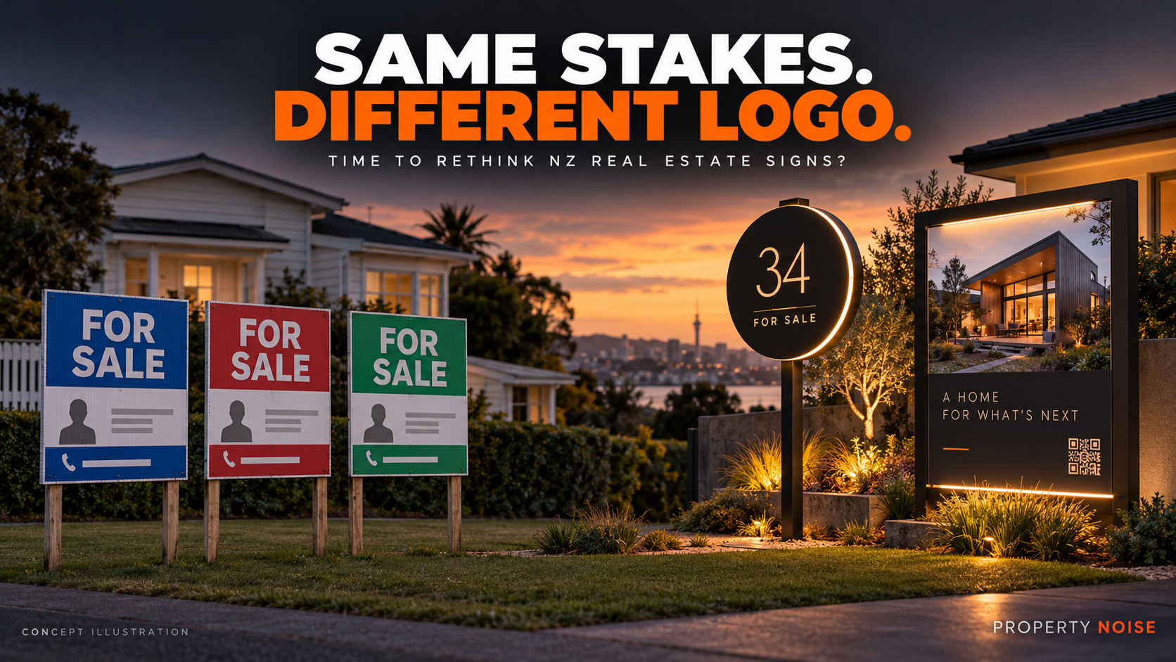
Two stakes. A rectangle of corflute. An agency logo. A smiling salesperson. A phone number.
Change the colours and you could be looking at the next listing down the road.
For an industry selling homes with distinctive architecture, individual histories and very different reasons to buy, New Zealand real estate signage can feel remarkably interchangeable.
Agencies promise tailored marketing. Yet the first thing a buyer encounters outside the property often looks like a template.
If the home is different, why does the sign feel so familiar?
This is Property Noise’s assessment of a familiar design formula, rather than a nationwide audit of every agency’s boards. There are exceptions—including inventive work already happening here.
But overseas examples show just how much more the humble “For Sale” sign can do.
WHY DO NZ REAL ESTATE SIGNS LOOK SO SIMILAR?
The standard sign has practical strengths.
Corflute is lightweight, and a familiar format makes printing, installation and replacement straightforward. New Zealand supplier DIY Real Estate offers conventional corflute property signs in different sizes and thicknesses, illustrating how established this format is.
A consistent agency design also helps people recognise the brand.
None of that is inherently bad. A readable, well-positioned sign has a useful job: tell people the property is available and show them how to enquire.
The problem begins when operational convenience becomes the entire creative brief.
Our view is that the familiar formula persists partly because templates are easy to repeat, brand consistency is comfortable and a standard board feels like a safe purchase. Those are plausible explanations—not findings from research into individual agencies’ decisions.
But sellers are entitled to ask whether “safe and familiar” is the right approach for their particular home.
WHO IS THE SIGN ACTUALLY SELLING?
Try this test next time you pass a property sign:
What do you remember—the home, or the agent’s face?
The salesperson’s identity matters. Buyers need to know whom to contact, and an established agency can provide reassurance.
However, when the portrait and logo dominate, the property’s strongest selling point can become an afterthought.
A buyer might care about the sunny courtyard, a practical layout, a separate workspace or easy access to local amenities. Those benefits deserve space on the board.
There is a difference between identifying the professional handling the sale and making that professional the main attraction.
Property Noise has explored the wider question of what sellers receive for their money in AI Is Coming for Real Estate Commissions—Are NZ and Australian Agents Ready?.
The same scrutiny belongs in the marketing conversation: what is each component supposed to achieve?
WHAT INNOVATIVE REAL ESTATE SIGNAGE LOOKS LIKE OVERSEAS
Innovation does not have to mean a giant screen on every suburban lawn. Sometimes it means changing the shape, improving visibility or making the next step easier.
UNITED STATES: COMPASS RETHOUGHT THE SIGN ITSELF
In 2018, US brokerage Compass introduced an illuminated sign with a distinctive circular design.
A contemporary account from Compass-affiliated team The Goodhart Group described beacon technology connecting nearby users of the Compass app with listing information. It also described a Waze partnership intended to help people find sign locations. This is a historical example, rather than confirmation that those features remain available today.
The important design lesson is the ambition: treat the board as a connection between the physical property and its digital listing.
For New Zealand, that could be achieved much more simply through a prominent, property-specific QR code and a short web address.
A buyer standing outside should be able to reach the floor plan, photographs and viewing information quickly.

A distinctive circular, illuminated sign introduced in 2018—a clear departure from the standard rectangular board. The Goodhart Group
AUSTRALIA: SIGNS THAT WORK AFTER DARK
Australian supplier Briner offers its Low Lux illuminated real estate boards with solar power, light-level sensing and timer controls. The company describes internal illumination designed to highlight the property without creating an excessively bright street display.
The practical appeal is obvious: a board can remain readable when people pass after sunset.
That does not establish that illumination increases sale prices. It does show a way to extend a sign’s useful viewing hours.
New Zealand has suppliers in this space too. Solar Signs advertises illuminated real estate signs alongside printing, installation and removal services. The idea is already available locally; overseas agencies do not have a monopoly on it.
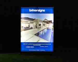
Australian supplier Briner offers illuminated property boards designed to remain visible after dark.
UNITED KINGDOM: BREAKING OUT OF THE RECTANGLE
UK supplier Screentec offers digitally cut, custom-shaped estate-agent boards, including a shaped “To Let” example made from corrugated plastic.
That matters because it challenges the assumption that innovation requires expensive electronics.
A different outline, stronger typography or a more thoughtful arrangement can give familiar materials a fresh appearance.
The shape still needs to serve the message. A clever board that makes the address or contact details difficult to read has missed the point.
SWEDEN: THE AGENCY WINDOW BECOMES A LIVE DISPLAY
A supplier case study describes Swedish agency Florin Partners using digitally managed screens in its office and windows to display property videos, infographics and listing information. Content could be updated remotely.
This is office-window signage, rather than a residential lawn sign, but it offers a useful lesson.
An agency’s street presence can explain properties and keep information current, rather than relying entirely on static cards.
The case study does not provide independent evidence of higher sale prices. Its value here is the documented approach.
NEW ZEALAND ALREADY HAS EXAMPLES OF THINKING DIFFERENTLY
Property Noise previously covered a real estate agent offering bilingual “For Sale” signs in te reo Māori and English.
That story featured First National salesperson Andrea Fenton and showed a different kind of innovation: adapting the language to the community.
A sign does not need flashing lights to feel more relevant.
It can speak more clearly to the people who live nearby, reflect the character of the property and make buyers feel that somebody has considered the audience.
Property Noise’s coverage of a Florida agent using humour to make property marketing memorable explores another departure from the standard formula.
That example concerns video and social media rather than signboard design. But the creative question carries across: what would make someone notice and remember this particular property?
WHAT WOULD A BETTER NZ PROPERTY SIGN INCLUDE?
A stronger sign should answer three questions quickly:
What is available? Why should I care? What do I do next?
Here is how that could change the familiar format:
| Familiar approach | A more useful alternative |
|---|---|
| Agency branding dominates | Make the property’s strongest genuine benefit prominent |
| Several small photographs | Use one clear image that communicates something important |
| Generic advertising language | Give a specific, accurate reason to investigate |
| QR code leads to the agency homepage | Link directly to this property’s information |
| Viewing details are difficult to find | Make the next open-home time easy to read |
| Every home uses identical copy | Adapt the message to the likely buyer |
| Entire board replaced for each campaign | Consider a reusable frame with replaceable panels |
The last option deserves an environmental assessment rather than an automatic “green” label. Materials, transport, durability and actual reuse all matter.
And every design should work for someone who does not want to scan a code. Keep a readable phone number and straightforward contact route.
SELLERS SHOULD ASK FOR MORE THAN A SIGNBOARD LINE ITEM
Before approving a marketing package, ask to see the proposed board.
Who chooses the photograph? Can the headline be tailored? Where does the QR code go? What happens when viewing details change? What does the sign cost?
The Real Estate Authority says agents must explain and record how a property will be marketed before an agency agreement is signed, and recommends client approval of advertising. Its guidance also sets out required identification and licensing information for signage.
Creative design still needs accurate claims, required information and suitability for the location.
Most importantly, ask how the agent will assess whether the board generates enquiries. Attention is useful; useful buyer interest is the goal.
A BETTER SIGN WILL NOT RESCUE THE WRONG PRICE
There is no evidence in the examples reviewed that an unusual sign alone guarantees a faster sale or a higher price.
Pricing, presentation, location, buyer demand and negotiation still matter enormously.
But that is hardly an argument for repeating a tired design without questioning it.
A seller should be able to expect both sound sales advice and marketing that shows some thought.
Keep the stakes if they work. Keep the corflute if it makes sense. But give buyers a reason to remember the home.
Property Noise opinion and analysis. Overseas examples include historical agency announcements and supplier-described products; they are not independent proof of improved sales results.